


Artsy Crafty Library: Color Theory
intro
Color Theory is the science of how colors interact with each other and how those colors make us feel. These ideas apply to nearly all works of art, but they are also practiced in many other areas. From bold colors in ads that draw our attention, to calming hues used to evoke a sense of peace in interior design, the power of color extends beyond the canvas. Even plating techniques at high-end restaurants apply the principles of color theory to create engaging dishes that appeal to both our eyes and tastebuds. Let's dive into how this works.
The Color Wheel is the foundation of Color Theory.

color theory
Applying the principles of Color Theory
You can use many different color schemes to create feelings or responses. Complimentary colors are colors that are directly across from each other on the color wheel. Using these intense combinations will engage or entice the viewer. For example, FedEx uses the colors blue and orange in their branding. It’s an iconic color combination that's instantly familiar to most people. Below is another example of a complementary color scheme. Someone carefully constructed the plate of food to look both elegant and effortless. But the use of the complementary colors red and green entices us and creates anticipation about the meal.
plate

analogous
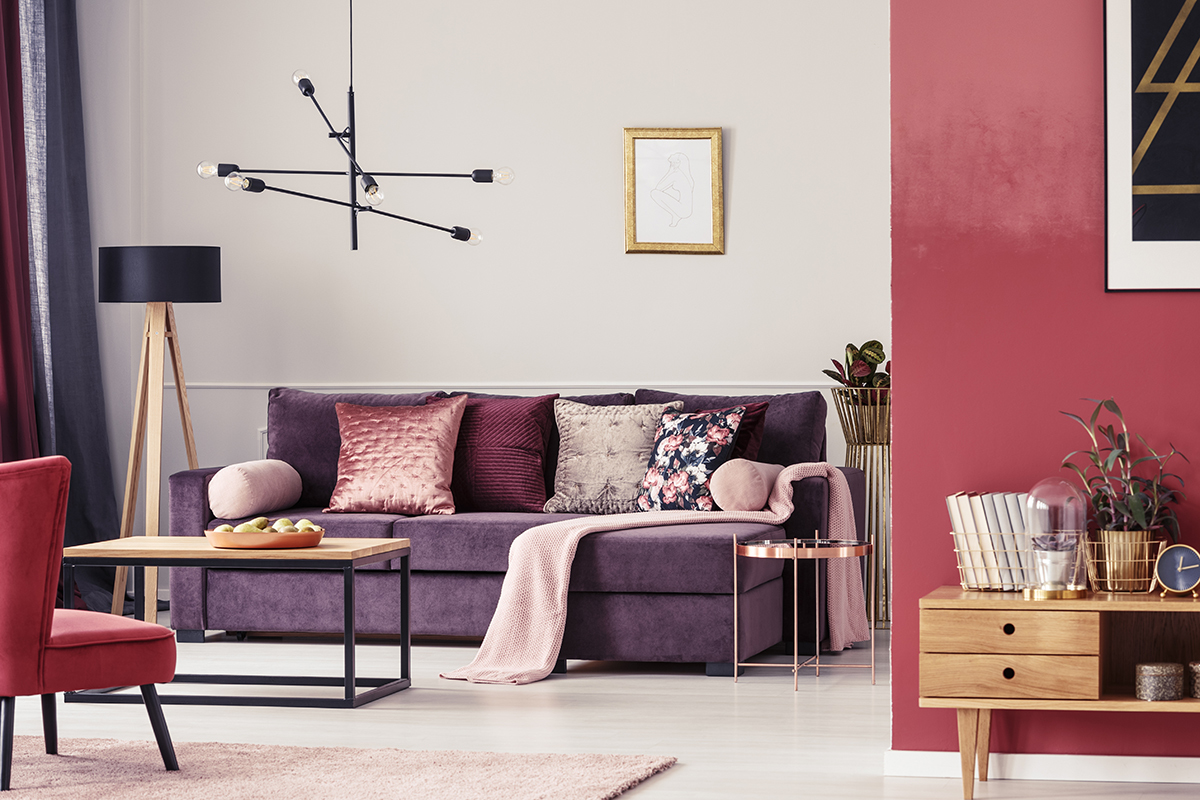
Another useful color composition is the analogous color scheme. This color scheme uses three or more colors that are next to each other on the color wheel. The term “analogous” refers to corresponding to each other. A great example of an analogous color scheme is Claude Monet’s painting The Water Lily Pond. In this famous work of art Monet heavily relies on the colors green and blue, and yellow to a lesser degree. Yellow, green and blue are adjacent to each other on the color wheel. Using these colors often elicits feelings of serenity. Below is an example of an analogous color scheme in interior design. The designer of this room chose red, red-violet and violet to create a unique, fun and welcoming space. Despite the use of vibrant colors, the room feels calm and cohesive.
room
monochromatic
One of my favorite schemes is the Monochromatic color scheme. Some think of this scheme as being only black, white and gray. A monochromatic scheme can be made of any single color and lighter and daker shades of that one color. Picasso’s Blue period is a famous example of how the monochromatic color scheme can be used to elicit emotion. The heavy, dark, repetitive shades of blue along with his painting style and subject matter express feelings of loneliness or isolation, or poverty and despair.
Monochromatic schemes can express many different vibes. Below is an example of a monochromatic color scheme. The woman is dressed head to toe in different shades of pink. Her outfit as well as her movement indicate a sense of joy and excitement. She looks like she is ready to take on whatever may come her way.

There are seven major color schemes, so these three are only an introduction to the many schemes you can use to bring out your own personal color style in your home design, craft projects, garden planning and fashion statements. Check out these books to learn more or to see how you can apply these ideas to any number of projects!